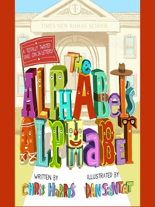
The Alphabet's Alphabet
کتاب های مرتبط
- اطلاعات
- نقد و بررسی
- دیدگاه کاربران
نقد و بررسی

Starred review from June 15, 2020
The alphabet comes out to play! This delightfully entertaining alphabet book stands out in a very crowded field. The letters look like themselves, naturally, but they're also shown to closely resemble others in their abecedarian family--with slight tweaks. Charming opening and closing poems explain that letters are all interrelated, just as members of the human family are. As in many an alphabet book, the letters are ordered sequentially. They're announced in Harris' marvelous, rollicking rhyming pairs that read and scan beautifully. Each actual letter is named and depicted straightforwardly but is then identified, verbally and pictorially, on the same page as the letter that it genuinely is in different, fanciful circumstances. For example, "An A is an H that just won't stand up right. / A B is a D with its belt on too tight." In the first instance, H's usually erect left upright collapses against the right one in sweltering desert heat, forming A; a tight belt tightly cinches D's waist, forming B. Santat's colorful, riotous alpha-illustrations imbue pages or spreads with comical visual details, such as verbal and/or visual puns and/or commentary from the letters. Humans are depicted as racially diverse. Children will love creating similar poems and illustrations. Endpaper artwork features lined paper familiar from primary schools, with numbered arrows demonstrating the directions of the strokes needed to form alphabet letters. Readers are challenged to decode a clever secret message on the rear endpaper. Alpha-BEST! A sure-fire winner and a B-U-T of a book. (Picture book. 4-8)
COPYRIGHT(2020) Kirkus Reviews, ALL RIGHTS RESERVED.

July 1, 2020
PreS-Gr 1-The letters of the alphabet have more in common than meets the eye; in fact, they may be a family. An "A is an H that just won't stand up right, a B is a D with its belt on too tight, and a Z is an L in a tug-of-war fight." Harris (I'm Just No Good at Rhyming) offers an ingenious and humorous look at the alphabet in a hand-lettered text, where speech bubbles accompany the chatty letters. Children will engage with the rhyming text and have fun deciphering the images. With over-the-top creativity, Santat's illustrations use a soft colored palette of secondary colors. VERDICT For use in preschools or alphabet-themed story times, this funny and creative ABC book will delight children and adults alike.-Kathia Ibacache, Univ. of Colorado Boulder
Copyright 2020 School Library Journal, LLC Used with permission.

July 1, 2020
Preschool-G This clever guide will reveal the letters of the alphabet like you've never seen them before. Harris takes readers from A to Z, pointing out, in humorous fashion, the similarities each letter has to another (with S being the single exception). For example, An A is an H that just won't stand up right. A B is a D with its belt on too tight. Colorful digital illustrations feature the characters, each set in its own frame, performing a variety of activities: working out at a gym, getting sunburned in a lounge chair, getting a haircut, and reading in a library. The tongue-in-cheek rhyming text is engaging and will be appreciated by youngsters. Endpapers, showing the alphabet printed in mainly capital letters, employ arrows that show how to form each letter. The mixture of uppercase and lowercase letters and the fact that many of the letters are not formed in the conventional manner could be confusing to new readers. With that small quibble aside, there is much here to entertain youngsters in this engaging exploration.(Reprinted with permission of Booklist, copyright 2020, American Library Association.)

July 20, 2020
This alphabet comedy by Harris (I’m Just No Good at Rhyming) uncovers unexpected family resemblances between letters of the Latin alphabet: “For all of the letters—from A on through Z—/ Can look like each other in some way, to me.” “A G is a Q that has started to yawn/ An H is a U with a pair of stilts on.” In spreads with warm, dramatic lighting; sunny colors; and plenty of word balloon chatter, Santat (Lift) portrays the letters as physical bodies, bent and straight, portly and thin, and supplies domestic particulars: G’s bedroom has a heavy metal band poster on the wall (“AB/CD”) and a stuffed lower-case r to cuddle. The collaboration produces an amusing, imaginative excursion, and it prods readers—especially those new to reading and writing—to visualize similarities between the symbols. Harris’s versifying nails rhyme and meter, and Santat’s endless stream of energy (J slumps, sunburned in a deck chair, to become a U, having lost its sunglasses and knocked over its drink) delivers one over-the-top gag after another. Ages 4–8. Author’s agent: Richard Abate, 3 Arts Entertainment. Illustrator’s agent: Jodi Reamer, Writers House.


دیدگاه کاربران