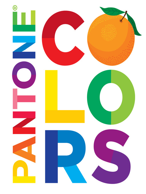
Colors
Pantone
کتاب های مرتبط


- اطلاعات
- نقد و بررسی
- دیدگاه کاربران
نقد و بررسی
January 16, 2012
This smart and playful board book uses the Pantone Matching System to explore variations in familiar colors. On the right, a familiar object (a yellow lion, a pink piggy bank) rendered in Dardik’s friendly, chunky style represents each color, while a chart on the left displays 20 different shades of said color in square panels that correspond to official Pantone colors. Shades of red (embodied by a red wagon) include Ladybug Red (Pantone 200) and Chili Pepper Red (Pantone 7427), while blues range from Teapot Blue (Pantone 284) to Police Officer Blue (Pantone 2727). It’s an evocative exploration of the nuances of color, in a polished, eye-catching package. Up to age 5. Illustrator’s agent: Lilla Rogers Studio.
July 1, 2012
A bright, cheerful illustration of the reason why picture books shouldn't be product-placement vehicles. Although the back lists the illustrator credit in miniscule font, the front cover and spine credit only "PANTONE(R)" as creator of this concept piece. PANTONE(R) is a company that offers a trademarked system of standardized colors--a method of specifying and matching colors from afar. Here, each right-hand page features a cartoony object in a single hue, while the facing left-hand page has a 20-square grid of variations on that hue. Assets are the vibrant visual energy throughout and an emphasis on hue variations that can be detected in the facing illustration. But every variation broadcasts a name and identity number--and the brand, lest readers forget. Some names are cutesy ("Pink Lemonade Pink: PANTONE 210"), others meaningless as color identifiers ("Apron Blue: PANTONE 314"; "Mitten Purple: PANTONE 259"). Readers old enough to comprehend the PANTONE concept will have long outgrown this toddler-friendly art; worse, when they read the disclaimer that "PANTONE Colors may not match PANTONE-identified standards. Consult current PANTONE Color Publications for accurate color," they'll be disgusted that a color standardization company is betraying its own raison d'etre. Twenty times per spread is too much brand trumpeting for, well, anyone; still, this will sell as a baby-shower gift for expectant graphic designers. (Board book. 1-3)
COPYRIGHT(2012) Kirkus Reviews, ALL RIGHTS RESERVED.
April 1, 2012
PreS-K-The purpose of this board book is rather obscure. Its construction would seem to indicate a preschool audience. On the recto of each section, an animal or object representing a particular color is presented, while on the verso, a grid with 20 boxes labeled with a Pantone color name and number appears. There is no way to determine which of the specific Pantone colors were used to construct a particular animal or object as many are markedly similar, and the animal or object can't be held against the grid to determine a distinct match. The illustrations of the nine animals and objects, which appear to be digitally rendered, are bright, cheerful, and child-friendly, which might make the book suitable for one-on-one sharing. An adult could discuss the many color variations. However, while many of the names are interesting, some are confusing. "Lemon yellow," "daffodil yellow," etc., are fine, but "soap orange," "pillow purple," "apron blue," "Grandma gray," etc., seem just random. Attractive, but not essential.-Grace Oliff, Ann Blanche Smith School, Hillsdale, NJ
Copyright 2012 School Library Journal, LLC Used with permission.


دیدگاه کاربران